Magazine Analysis
The name of the film in bold writing is important because the audience will know what the film in the front cover is called. The writing is displayed in basic colour and simple font. However, the colour of the writing is quite a cold colour that reflects to the cold feeling when someone is dead just like the girl.
The only bright/standing out colours are used to give information to the audience about the film and mentioning famous directors and actors which will attract the audience and the fan base.
|
'exclusive' in a blue coloured box thats stands out and is above the movies name is shown to make the audience interested more and feel alert with new information that others may not know about.
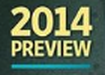
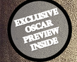
This shows the release year of the film and 'preview' , giving a sneak peak to the audience with more detail about the film.
|

Magazine name right at the top behind the characters is a common way of a magazine to be displayed. The fact that he is mainly laying over the writing shows that he does not really bothered about anything else but her ,which makes him seem obsessed. This is another way of exposing him of potentially murdering the girl.
This information on the front of the magazine cover makes the target audience more interested in finding out more about exclusive stuff.
|
The use of the blue star symbol help navigate the audience around the front cover. It directs their attention to the appealing information that the viewers may want to know.
This cover line shows what information and films will be featured inside the magazine. They have also used the blue star symbol here too, to help navigate the audience.
|
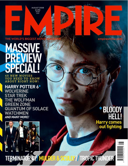
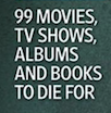
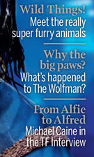
'45 NEW MOVIES YOU NEED TO KNOW ABOUT RIGHT NOW!' This use of text grabs the audience's attention. Th use of words such as 'need' and right now' emphasise that if the reader does not pick up this magazine, they will miss out of the important information inside.
|
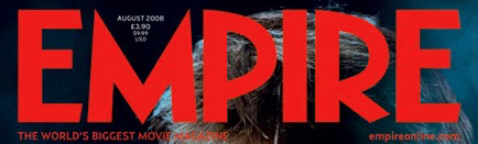
The masthead is usually the biggest and brightest text on the front of a magazine cover. This is because it draws attention as it stands out above everything else.
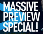
The large bold writing attracts the audiences attention as it's bigger than the other text. The word 'massive' also implies the extent the magazine

The rule of three is used here- the cover line shows what is going to be featured in this issue of the magazine.
|
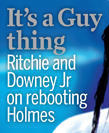
The colours and language both show that this issue is mainly based on the male gender. This is implied with one of the cover lines being 'It's a Guy thing' which will entice male audiences.
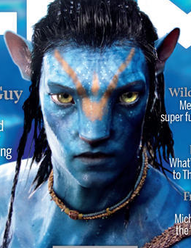
The main image takes up the majority of the page and also covers part of the masthead. This ensures that the image stands out, and the fact the character is looking straight at the audience catches the audiences attention,
|
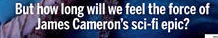
Having this at the bottom of the page leaves the audience on a question to make them want to read on.
The poster relates to the genre of the film with the 'feel the force' part of the bottom cover line. |
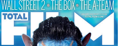
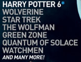
The banner shows what films are going to be included in the magazine. It uses the rule of three which is effective.
The cover lines show what is featured inside the magazine. These are featured predominantly on the right side of the cover but they also feature on the left.
|
Our final magazines - analysis

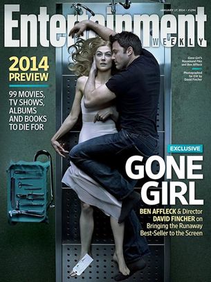
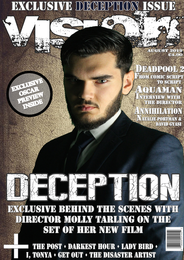
The title of the magazine has acquired a font that represents themes from the trailer. The glitch implying a distorted reality, (as well as a glitch on the image of the main actress) illustrating there is something not right.

This attracts the audience as the shape of the banner stands out and makes people want to read more.
|
The rule of three is used here in the cover line to show what is going to be featured in this issue of the magazine.
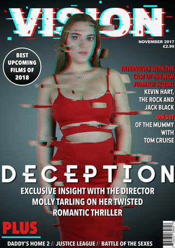

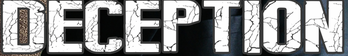
The title is kept white to fit in with the colour scheme and also to prevent clashing with the magazine name at the top.
|
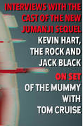
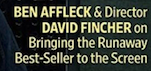
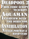
This cover line stands out as there is two colours separating the text making it eye catching and easy to read. It gives examples of what's included inside the magazine.
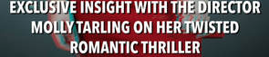
This will attract audience who are interested in the thriller genre, or for anyone who has seen any other movies directed by this person (and are fans of their work)
|
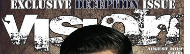
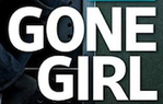
This title of the magazine includes parts of it faded away slightly which relates back to the idea of disappearance in trailer.
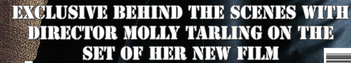
For anyone who has seen any other movies directed by this person (and are fans of their work) they will be interested and attracted to read more about the making of their film.
|
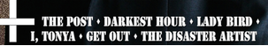
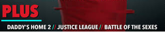
The plus sign attracts the audience as it stands out on the page to look there. This cover line mentions other 'big' films that the issue will cover.
|
The rule of three is used here. It gives the audience some knowledge of what this issue will include.
The font of title of the film has also followed the themes and events of the film (i.e. the 'broken glass') making it relatable to audience.
|
