|
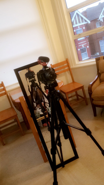
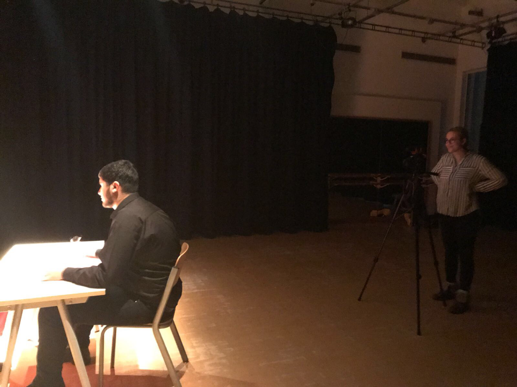
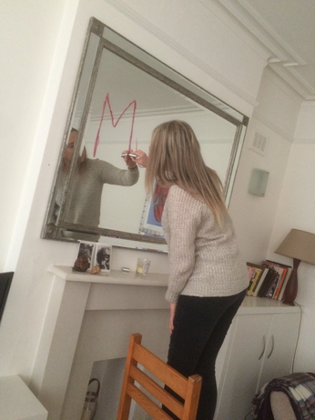
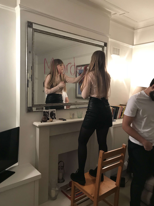
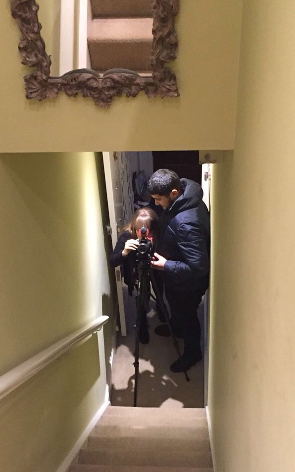
Today me and Julia joined up to do my evaluation question- In what ways does your media product use, develop or challenge forms and conventions of real media products? I wanted my evaluation to be set up like a relaxed Tv chat show, similar to The Ellen Show so we decided to shoot it in my living room on the sofa to give off that chilled vibe. We face many challenges doing this, apart from making sure the whole thing flowed properly. We had to make sure it was done well throughout the whole clip because unlike a youtube channel, you can crop out the bits you don't want and you can mess up and edit it out. Whereas a tv show is slightly more professional and you have to get it right in one take, so we struggled to read the script properly some times so we had to start filming from the beginning again. We used the mirror to make sure that we were both in the shot at all times and also to let us see whether the card was full to let us know whether we needed to start recording again.
0 Comments
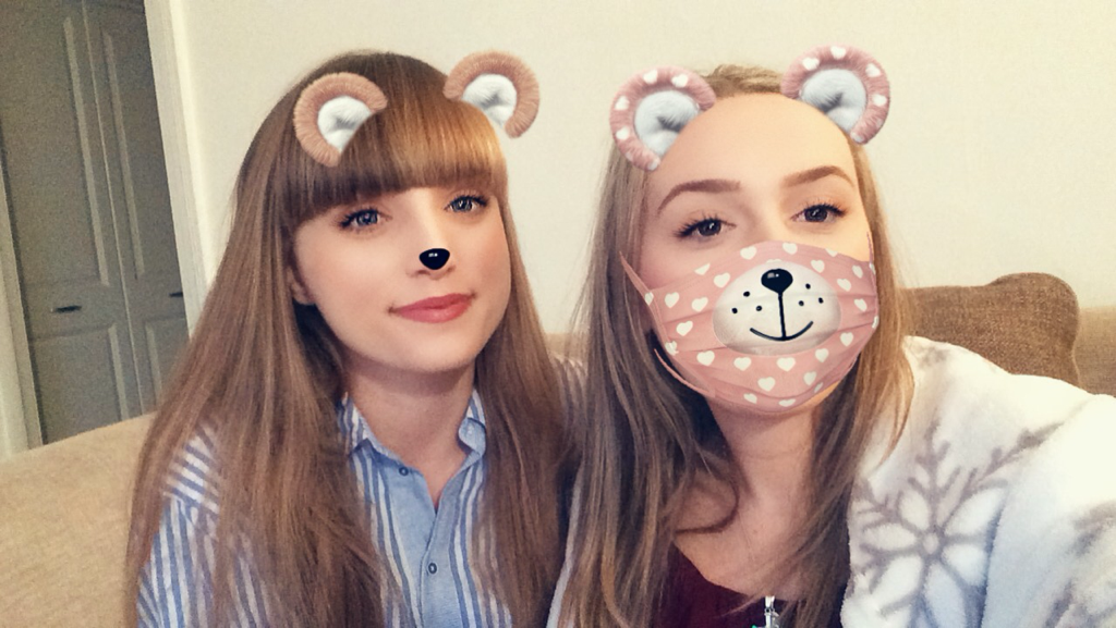
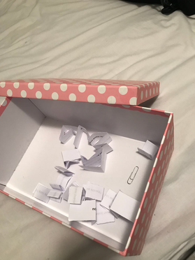
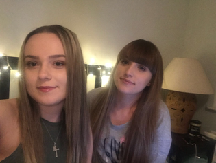
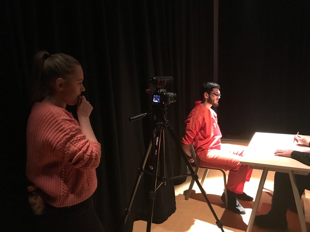
This week I helped Julia answer her evaluation question- How effective is the combination of your main product and ancillary texts? We wanted to do the question in the style of a YouTube vlogger, so we filmed it in my bedroom because we thought it would be the most realistic and effective place to film it, since there's fairy lights in the background (similarly to other girly youtube channels). We came up with the idea to have a 'movie night' and watch the new film Deception, that I directed. So in this evaluation question we had a box filled with questions that were supposedly from the audience on a previous video of hers, where she said she was doing a Q&A in her next video. We took turns in reading questions and answering them depending on the type of things were asked. We faced a small problem when filming on this day because at the beginning we hadn't fully plugged the microphone in the camera so we didn't have any sound. But luckily we realised before we got to far into filming. We also struggled a bit to remember the answers to the questions we had asked, but we put the answers on the computer screen so we were able to read it if we got stuck. The video contained a lot of waffling so by the end of it all, we had about 30 mins of footage. which is way too long, so we tried our best to cut it down and got it down to under 25 mins.
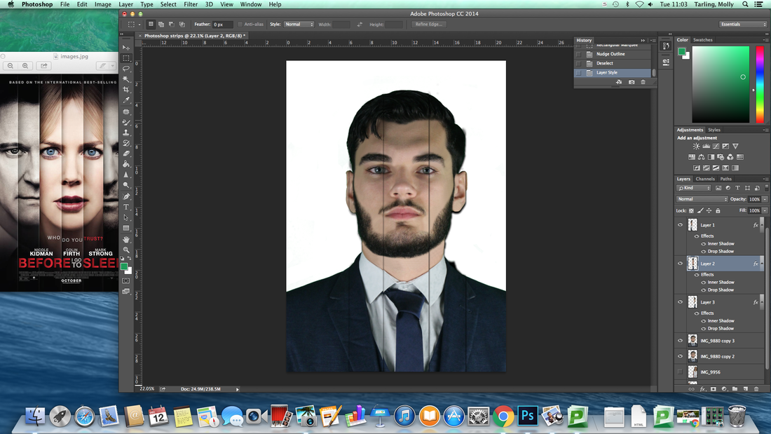
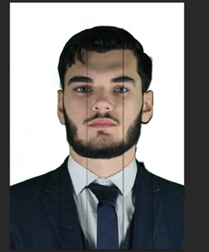
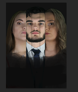
My main inspiration for this poster was from the movie Before I Go To Sleep. I made the layout very similar and followed the same design including the lines running down the actors faces, the positioning of the images and title of the film. It took quite a while cutting the strips out and making sure the spacing looked right and the layers on top were in the right place. We decided to use the full image of Durim's face and only half a section of Julia's and Georgiana's faces because we wanted most of the attention to be on Durim's character Calvin and imply he's the one to focus on in most situations of the trailer. I made sure I picked photo's of all the actors that were quite serious to show that the trailer won't be as romantic and happy as you'd think. I also picked photos where Georgiana and Julia were looking inwards, to make the poster look balanced and show the two sides of Calvin's life that are both starting to go wrong.
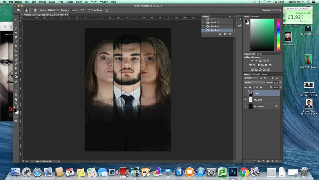
I then began to work on the shadowing of the poser. Because I left all the pictures in colour and didn't follow the same pattern as the Before I go to sleep poster where two of the characters were in black and white, I knew I needed to add some dark edges to it to illustrate the darker, more serious side of our trailer. I did this by using the burn tool and worked around the bottom edges of the image and around the tops of their heads also.
This was a quick rough idea of what our final product would look like. I placed the title in that position because there was too much blank space on the poster and this font and design on the title added some context to the poster as it represents the broken glass from our trailer. 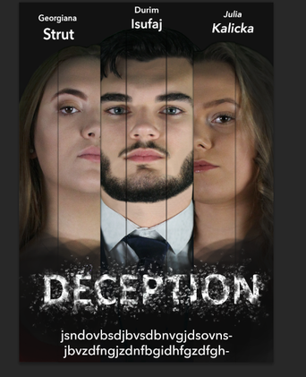 We planned to reshoot the interrogation scene as we had feedback from people watching our trailer that it does not show how he got out of prison. So we have decided to have a solicitor to get him out of the interrogation scene. Also we wanted to change the dialogue of the detective and calvin's answers. 
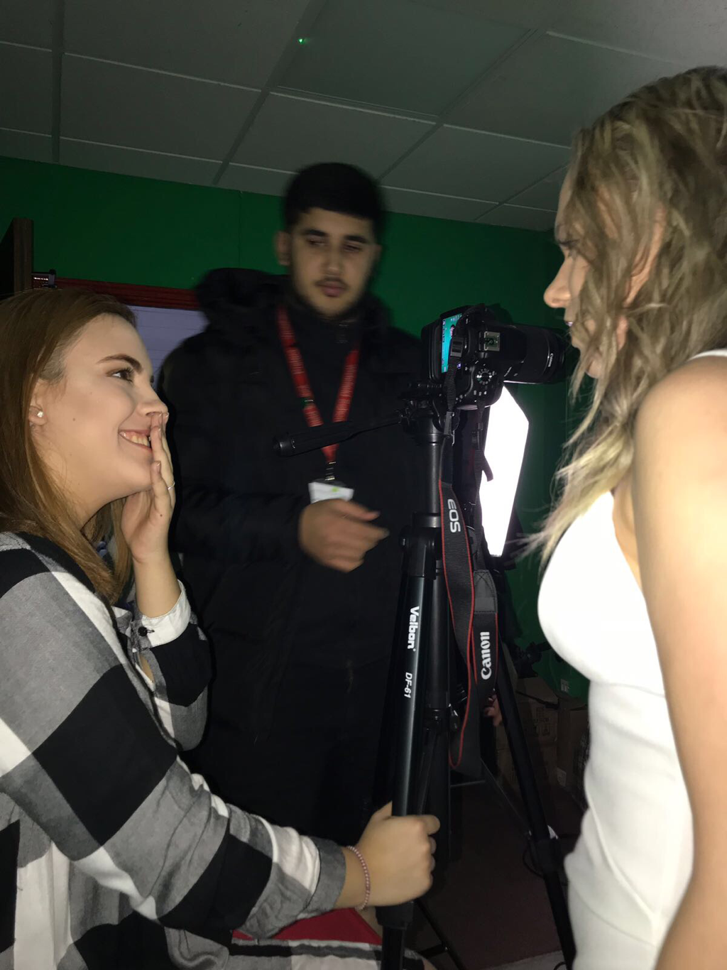
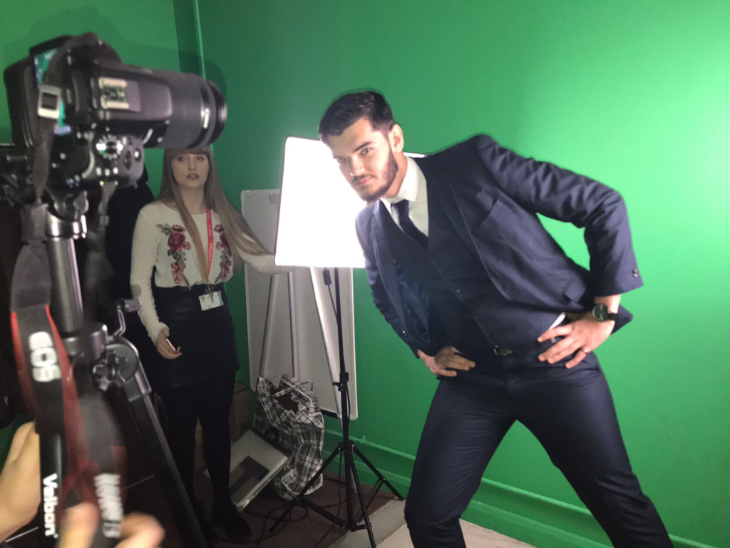
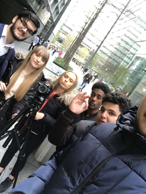
Today me and Julia came up with a rough design of a poster just to get some inspiration to see what our final product would look like. We wanted to include our main actors in the poster. 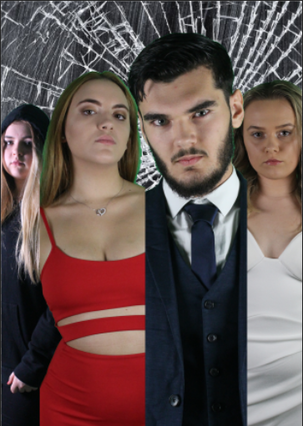 When brainstorming ideas for posters we tried to think of theme our trailer could be linked to. We came up with words such as greed, manipulation, lust and control. With these words in mind we came up with the idea to make Durim act like a puppet on strings who is being controlled by Georgiana's hand. In this photoshoot we made his body into realistic shapes, with dropping arms and bent legs to give the impression of a believable puppet and a weak man . This strings would later be added to the shot when editing the posters. In this shoot we also tried to get some different angles of Georgiana, and we also tried to vary the lighting in order to get the best effects from it. We experimented with rim lighting which is meant to make the person look quite sinister and dramatic, and we also tried river cop lighting to make Georgiana look suspicious. A lot of the pictures turned out quite well and we didn't face many problems we shooting this time.
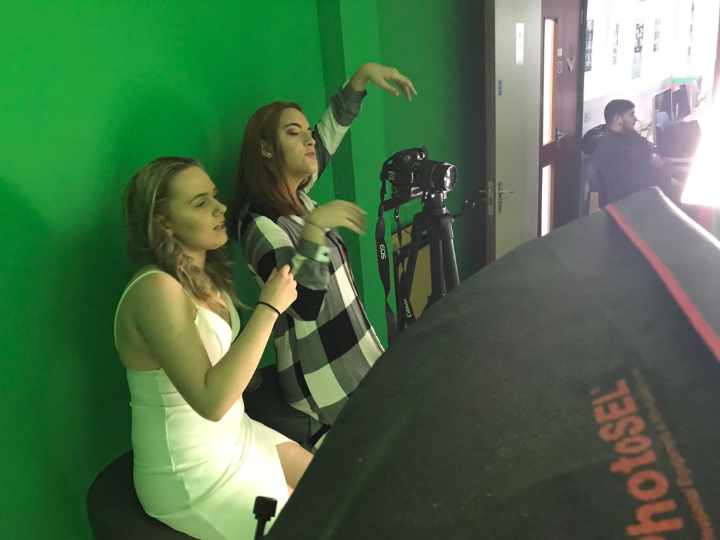
Today we decided to do the second photoshoot. This time we were more concentrated on pictures for the posters , so we tried to take as many different shots as possible to see what looked best and to find out ways in which we could improve our pictures. We came up with the idea of Julia wearing a white dress and Georgiana wearing a red dress, this was to subtly imply that Georgiana's character in the trailer is the "villain" in a sense and that Julia's character is the victim as she hasn't done anything wrong, yet gets all this drama added to her life by 'Rebecca's' greed. The colours of the dresses also could connote the sense of innocence on one side and a promiscuous/dangerous personality on the other and because of this large contrast in colour it would make them stand out and link to their characters. (This idea would then be carried out in our next photoshoot)
|